Brand Style Guide — v1.4
Brand Identity & Design System
01 — Logo
The RAZE Action wordmark is the primary brand asset. It consists of the heavy-weight "RAZE" logotype, the "ACTION" sub-label, and the signature diagonal red slash — a single unified system that should never be altered or separated.
01.0 — NON-NEGOTIABLE
The mark is a fixed piece of drawn artwork. It is always placed from the supplied logo files. It is never re-set, re-typed, re-traced or rebuilt in any typeface — including Anton, and including at the sizes where "close enough" would pass.
The typefaces in section 03 govern typeset copy around the mark — headlines, fighter names, labels, body. They do not describe the letterforms inside the mark, which belong to the artwork and to nothing else. If a layout needs the wordmark at a new size or colourway, scale or recolour the supplied file; if the file you need does not exist, request it rather than approximating it.
Primary · White on Black
Secondary · White on Dark Grey
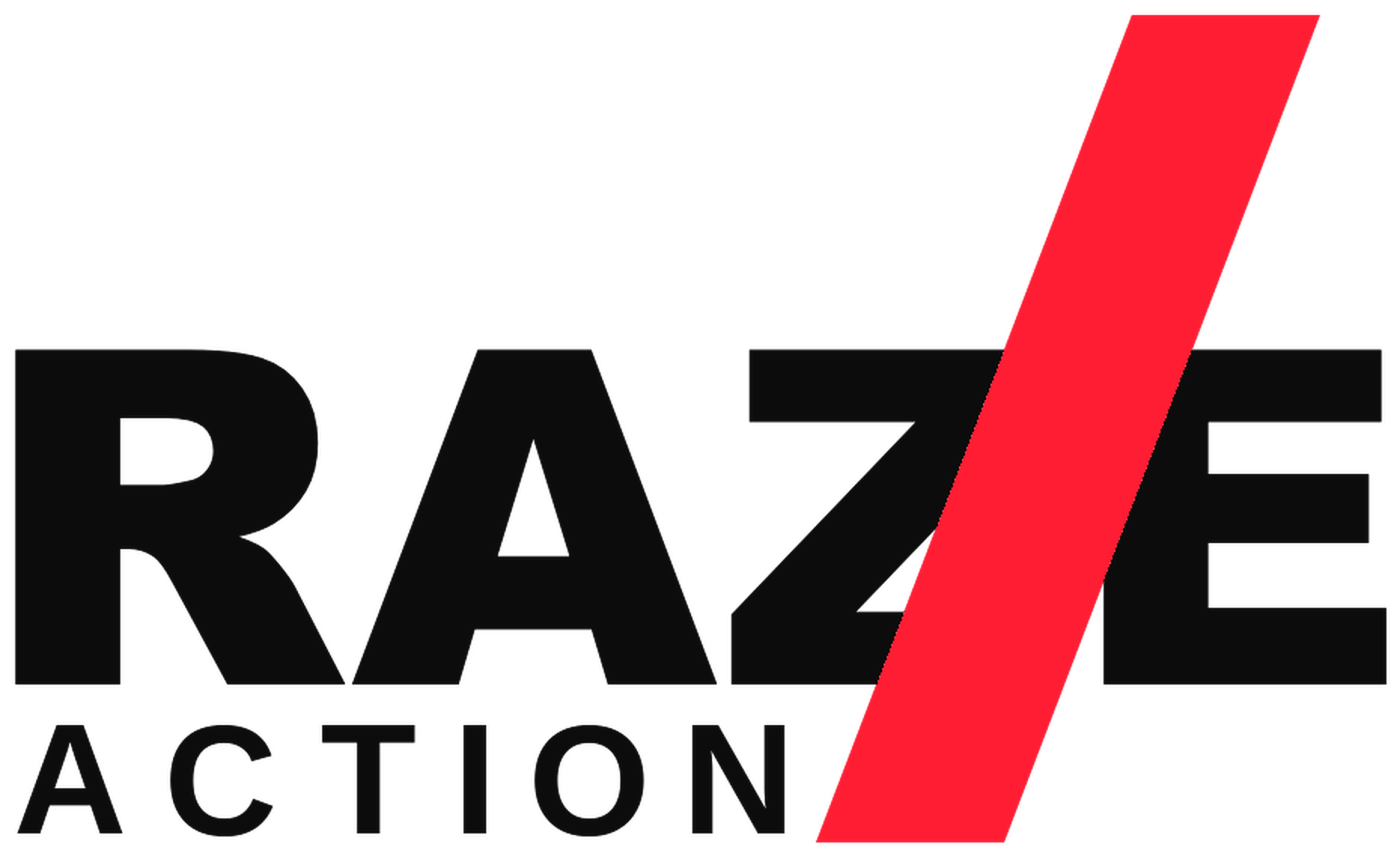
Reversed · Black on White
Inverted · White on RAZE Red
01.1a — MASTER LOGO FILES
All logo placement now uses the transparent PNG masters. The wordmark sits on a fully transparent background with no black or white box, so it drops onto any colour, photograph or video frame cleanly. The red slash is fixed at #E8112D in every file. Choose the colourway by background luminance, never by re-colouring the artwork.
Use the HQ file wherever the mark is placed above 400px wide or in print. Never place the white file on a light background, and never sit either file on a solid panel to force contrast — move it to a darker or lighter area of the frame instead.
Stacked Lockup (default)
Wide / Banner Lockup · transparent no-box master
× Height
× Height
× Height
× Height
Minimum clear space on all four sides equals the cap-height of the letter "R" in the wordmark. Never allow other graphic elements inside this boundary.
The exclusion zone is the protected area around the logo. It is defined as 1× the cap-height of the "R" on all sides for the stacked mark, and 1× the cap-height top and bottom, 0.5× cap-height left and right for the wide banner mark.
This space must always be free of text, imagery, and other graphic elements — including other logos, borders, or decorative devices.
Digital min · 120px wide
Print min · 25mm wide
02 — Colour
The RAZE Action palette is built on high contrast and restraint — near-black, white, and one bold accent. The red is the brand's single expressive tool; use it with intent, never decoration.
| Foreground | Background | Ratio | AA Normal | AA Large | AAA |
|---|---|---|---|---|---|
| Primary Type | Ground Black | 20.0 : 1 | PASS | PASS | PASS |
| Primary Type | RAZE Red | 4.6 : 1 | PASS | PASS | FAIL |
| RAZE Red | Ground Black | 4.3 : 1 | FAIL | PASS | FAIL |
| Tertiary / Muted | Ground Black | 6.1 : 1 | PASS | PASS | FAIL |
| Secondary Type | Ground Black | 12.2 : 1 | PASS | PASS | PASS |
| Ground Black | Primary Type | 20.0 : 1 | PASS | PASS | PASS |
03 — Typography
RAZE Action uses Anton for headlines, fighter names and key labels (LIVE PPV, RAZEACTION.COM) — but never for the wordmark itself, see 01, Barlow Condensed for sublines and records, JetBrains Mono for eyebrows, dates, handles and tabs — always tracked out, and Archivo for UI and body copy. All four are free Google Fonts.
CONTEXT A
Anton leads all typeset copy — but not the wordmark. Fighter names, event titles, LIVE PPV, RAZEACTION.COM. Barlow Condensed 600 carries sublines, records and city lines. JetBrains Mono, tracked to .28–.40em, carries eyebrows, dates, handles and tabs. Set at scale — nothing below 24px at 1080 wide.
CONTEXT B
Barlow Condensed 900 leads display and headings; Archivo carries UI and body copy. Anton is reserved for hero moments and brand marks — it is a poster voice and becomes heavy-handed across a full interface. Mono keeps its tracked-out label role.
One palette, one family set, two contexts. The specimens below are set in the face each level uses in its primary context.
04 — Slash Motif
The diagonal red slash is RAZE Action's signature graphic device. It appears in the logo as a bold parallelogram cutting through the "Z/E" junction — conveying speed, impact, and forward momentum. It can be extended as a design element across all brand touchpoints.
05 — Components
Core UI building blocks — all derived directly from brand primitives. The clipped corner on buttons echoes the slash motif's diagonal cut.
06 — Tone of Voice
RAZE Action speaks like someone who knows the sport from the inside. Confident, direct, never corporate. The writing style mirrors the visual identity: punchy, high-contrast, no filler.
"The belt is on the line. Watch every round, live and unfiltered."
"No filler. No fluff. Just the fight."
"Stream from £4.99. Cancel any time."
"Welcome to our amazing platform where you can enjoy fantastic content!"
"Don't miss this INCREDIBLE EVENT!!!! 🔥🔥🔥"
"Please find herewith the details of our forthcoming broadcast."
07 — Motion & Animation
Motion on RAZE Action should feel fast, purposeful, and impactful — never decorative or slow. Lead with the slash; cut don't fade. The system runs in two contexts: interface motion, and the broadcast promo language used on every event cut.
| Property | Value | Use Case |
|---|---|---|
| UI Micro-interaction | 150ms ease-out | Button hover, badge state, link colour change |
| Panel / Drawer entry | 220ms cubic-bezier(0.2, 0, 0.0, 1) | Menus, overlays, sidebars sliding in from edge |
| Content reveal | 300ms ease-out | Cards loading in, hero text animating on scroll |
| Logo slash intro | 400ms · slash cuts in first, then text fades | Brand intro / splash screen / ident opener |
| Exit / dismiss | 120ms ease-in | Modals, toasts, notifications fading out |
| Transitions to avoid | Bounce, elastic, spin, slow fade (>500ms) | These feel soft and corporate — not RAZE |
Every RAZE promo is assembled from the same parts in the same order. The timings below are not suggestions — they are what makes two cuts from two different events read as one channel.
| Element | Timing | Behaviour |
|---|---|---|
| Logo ident | 0 → 2.45s | Red slash drops in first (0.85s), black slash follows at +0.08s, mark wipes on at 0.45s, endline at 1.0s, strapline at 1.3s |
| Signature wipe | 0.42s + 0.46s, 0.06s offset | Two −14° skewed panels — red leads, black follows. This is the only transition. Never a cross-fade |
| Full-screen card | 2.0 – 4.5s | Always topped and tailed by a wipe. Also used deliberately to hide a jump cut when unusable footage is removed |
| Name plate / VS plate | 4.5 – 5.5s | Rule wipes on (0.35s), headline clips up (0.5s at +0.1s), subline fades (0.5s at +0.45s). Plates enter from opposite sides — top fighter from left, bottom from right |
| Rule reveal | 0.5s, origin left | scaleX 0 → 1, cubic-bezier(.16,1,.3,1). Every red rule animates; none simply appear |
| CTA bar | 0.5s rise, holds to final wipe | Rises from the lower edge. Must be fully in place before the covered artwork appears — see section 08 |
| End board | 3.4s | Slow 1.07 → 1.0 push over the whole card. Mark, rule, date, URL, handle, staggered 0.1 / 0.5 / 0.6 / 0.8 / 1.1s |
| Audio | 1.6s ramp out | Reel audio fades over the last 1.6s. Pull the ramp forward to drop a third-party name-check from a voice-over |
| Never | Bounce, elastic, spin, slow fade (>500ms) | Soft and corporate — not RAZE |
Ident → wipe → footage with name plate → VS plate → event title card → venue card → date card → tagline → CTA bar over the promoter's end board → wipe → RAZE end board. Drop cards to shorten; never reorder them. A 15-second cut keeps ident, one plate, date and end board.
08 — Broadcast & Promo
RAZE Action carries other people's events. Almost every asset we receive arrives already branded by a promoter, a venue, a ticketing platform and a wall of sponsors. This section governs what we cover, what we keep, and how the two brands sit together.
The CTA bar is the single most important brand element in an event promo. It is a solid #08080a band with a #e8112d top rule, carrying the mark, LIVE PPV, the date line, RAZEACTION.COM and the handle. It replaces third-party ticketing and sponsor logos at the base of supplied artwork.
| Canvas | Bar height | Top edge |
|---|---|---|
| 1080 × 1350 key art | 206px | y1144 |
| 1920 × 1080 key art | 150px | y930 |
| 2551 × 3579 print | 466px (14px rule) | y3113 |
| 1080 × 1920 motion | 530px stacked | mark over LIVE PPV over date |
| 1920 × 1080 motion | 234px | three columns |
RAZE mark top left, promoter mark top right, both at reduced opacity (0.95 / 0.80). Both bugs drop out under full-screen cards, under the CTA bar and across the ident and end board. The promoter's mark never appears on the RAZE end board — that frame is ours alone.
| Asset | Size | Notes |
|---|---|---|
| Social cut | 1080 × 1920 | Fighter hypes, training reels, interview cuts |
| Web cut | 1920 × 1080 | Event promos, long-form trailers |
| Key art | 1080 × 1350 · 1920 × 1080 | Feed and header |
| 2551 × 3579 | Poster |
Standard cut lengths: 15s and 30s for paid and social, 30–50s for fighter hypes, 90s+ for the full event trailer. Type never below 24px at 1080 wide.
09 — Spacing
An 8px base grid. All spacing uses multiples of 8. Generous negative space is part of the premium feel — resist the urge to fill every gap.
10 — Logo Don'ts
The logo must never be altered. These are the most common mistakes to avoid across all applications.